
Who Drew the Lines?
I was late to school so often that I spent entire mornings in the lobby during assembly. On the wall was the only honest map I have ever seen. Now they are taking it down.

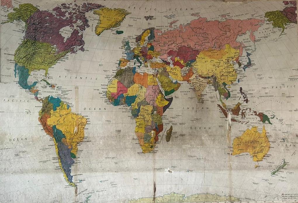
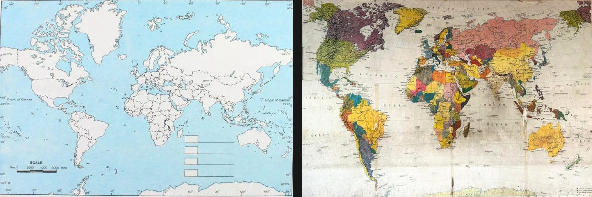
There is a map most of us grew up with. It hangs in classrooms, appears in textbooks, loads by default on screens. In it, Europe sits large and central. Greenland is roughly the size of Africa. The United States looms enormous above a tiny Latin America. India is modest. The continent of Africa — which could fit the United States, China, India, and most of Europe inside it simultaneously — looks like a middling landmass squeezed between two oceans.
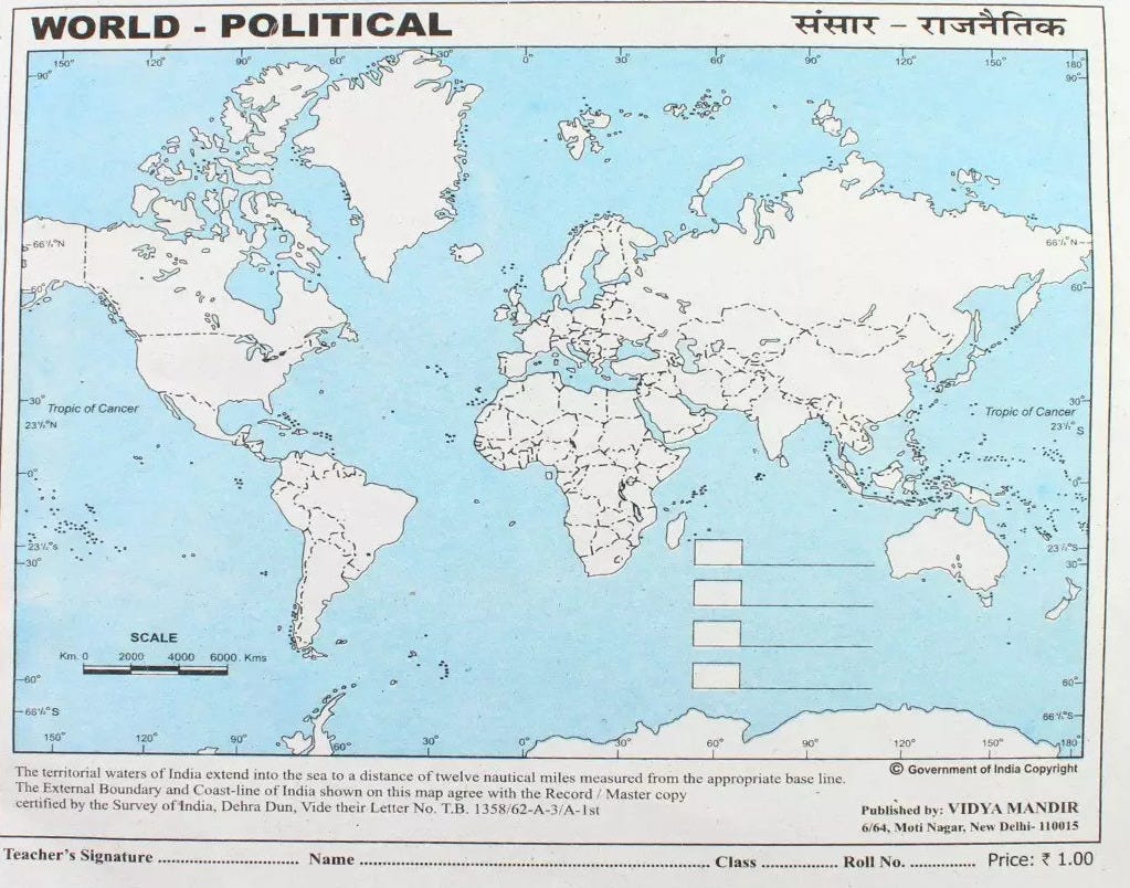
This is the Mercator projection. It was designed in 1569 by a Flemish cartographer named Gerardus Mercator, primarily to help European sailors navigate straight-line routes across oceans. It was a navigational tool. It was never meant to represent the relative size of places on earth. And yet — somehow, across centuries and continents and the very countries it diminishes — it became the map. The one that gets taught. The one that gets remembered. The one that becomes, quietly, the way you understand the world.
What does it do to a child to grow up believing the continent their family comes from is smaller than it is? What story does that tell, before they are old enough to question it?
I.
Here is a question that has always bothered me: is Europe a continent at all?
Look at a physical globe. There is no ocean separating Europe from Asia. No geographic boundary. It is one continuous landmass — what geographers sometimes call Eurasia — stretching from Portugal to the Pacific coast of Russia. The decision to call Europe and Asia separate continents came from ancient Greek geographical tradition, which divided the known world into convenient categories. And then European academic authority, over centuries, calcified that categorisation into fact. Into something that gets taught to children everywhere as though it were geology and not a choice.
India, for its part, existed in Ptolemy’s maps. In Arab cartographers’ maps. In the maps of the great Islamic geographers who were charting the world while Europe was largely not. Those traditions had their own ways of understanding and dividing the earth — ways rooted in trade routes, in monsoons, in the actual movement of people and goods across the actual world. Those maps did not place Jerusalem at the centre of everything. They did not inflate the familiar and shrink the foreign.
We do not teach those maps.
II.
The Peters projection — which corrects for the Mercator’s size distortions and shows landmasses in their true proportions — exists. It has existed since 1974. Africa is enormous on it, as it should be. Europe is appropriately modest. It is disorienting to look at if you grew up on the Mercator, which is itself a kind of answer.
The correct map was in the lobby of my school — where I would often be punished, and so spent hours standing there, staring at it, memorising the different places. There are children who grow up seeing that map. Most do not.
The wall is coming down. I don’t know what map, if any, will go up in its place. But I keep thinking about that image — the right map, gone — as a kind of accidental metaphor for something that keeps happening, especially now in the news.
III.
Here is what interests me most about this: the visual pattern precedes the political idea. Children learn the map before they learn the word colonialism. They absorb the relative size and importance of places on earth before they have the language to question it. By the time the political education begins — if it begins — the geography is already furniture. Already background. Already just the way the world looks.
This is how ideology works at its most effective. Not through argument, which can be countered. But through image, absorbed before critical thought has a chance to intervene. The Mercator projection is not propaganda in the sense of being deliberately designed to deceive. It is something more insidious — a tool designed for one purpose, repurposed for another, and then never questioned because it became the default.
The first world and the third world. The developed and the developing. The global north and the global south. These are not just economic categories. They are spatial ones. They rely on a picture of the world in which some places are large and central and some are small and peripheral. The map came first. The classification followed.
Either maps are just lines on paper — and then nations shouldn’t exist, borders are fiction, and the first world/third world distinction is a story someone made up.
Or the lines actually mean something — and then there should be a standard set for accuracy, and we owe it to every child being taught geography to draw them correctly.
The map on the wall means nothing, or it means everything.
I know which one I think is true. And I think you do too.